Website redesign + product page
Apple Why Mac
A one-off page that makes switching from PC feel easy.
The problem
There are a million reasons to buy a Mac. Convincing a lifelong PC user is another story. Apple needed a special one-off page, sent to specific audiences, that showed PC people a Mac had everything they needed.
The idea
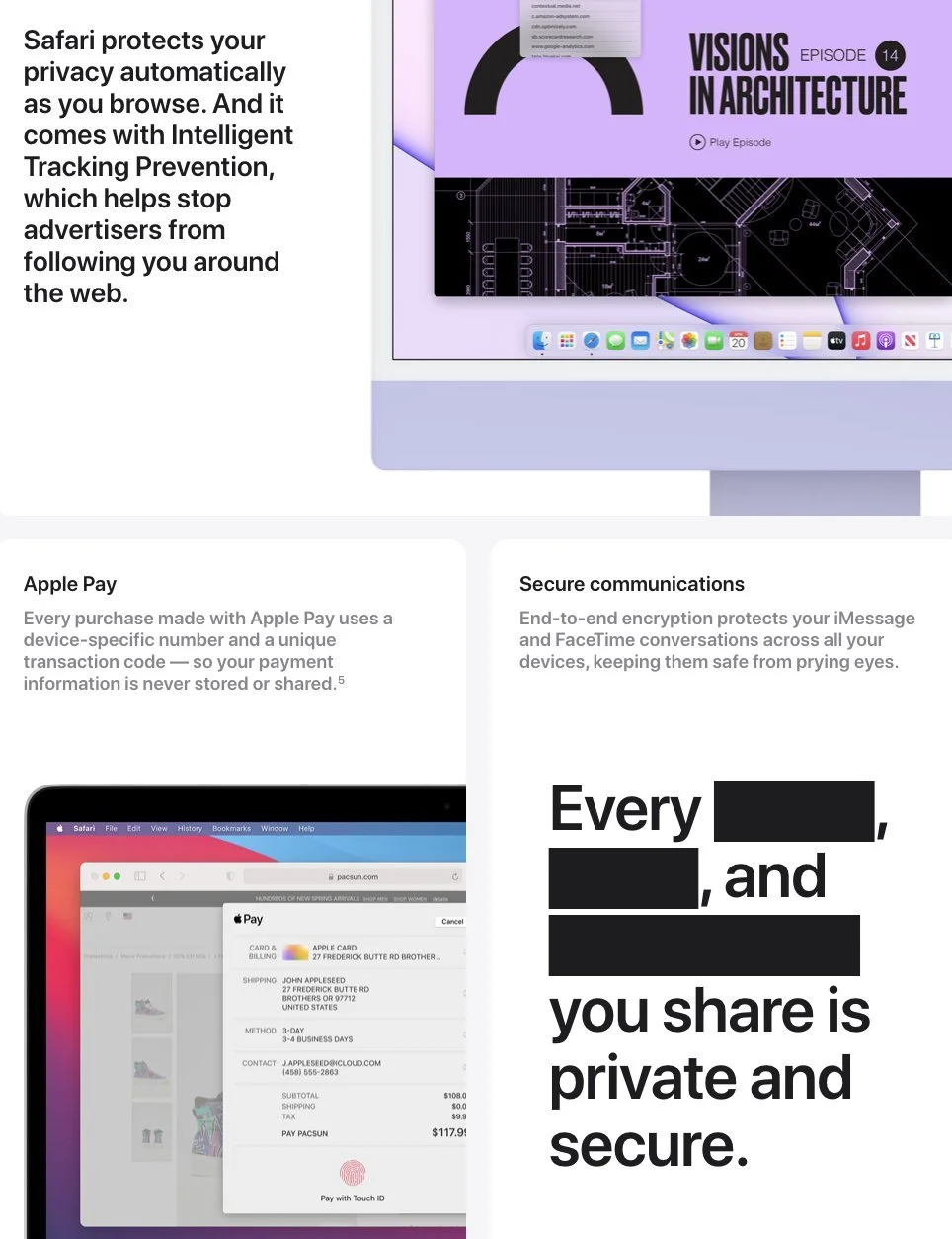
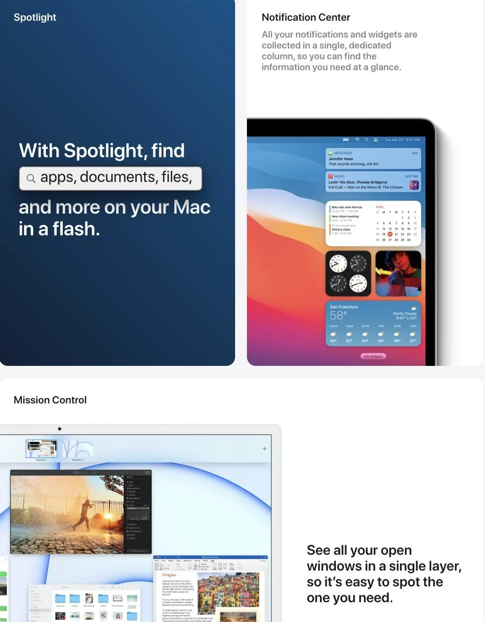
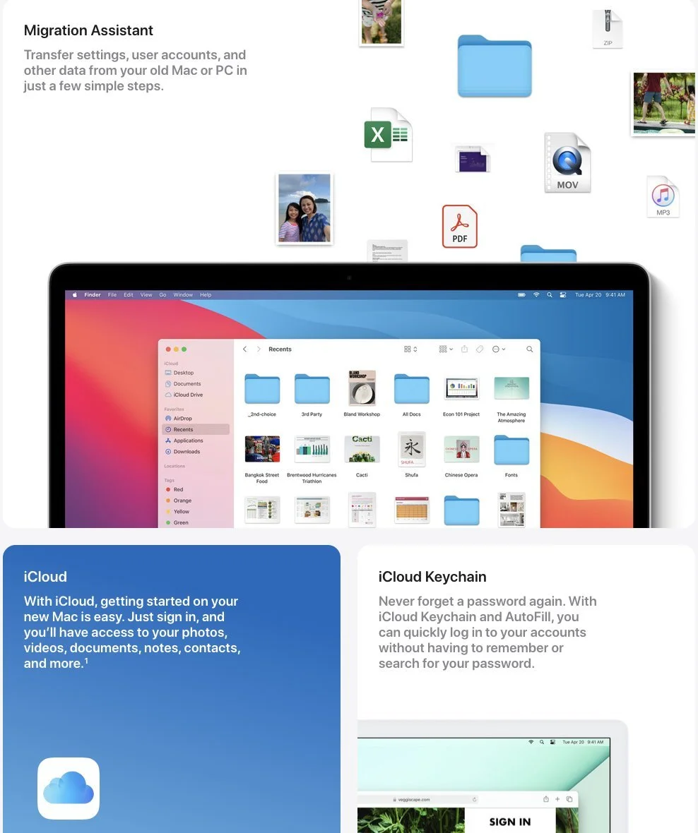
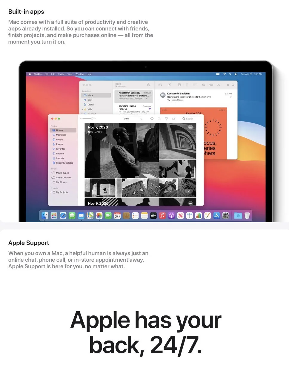
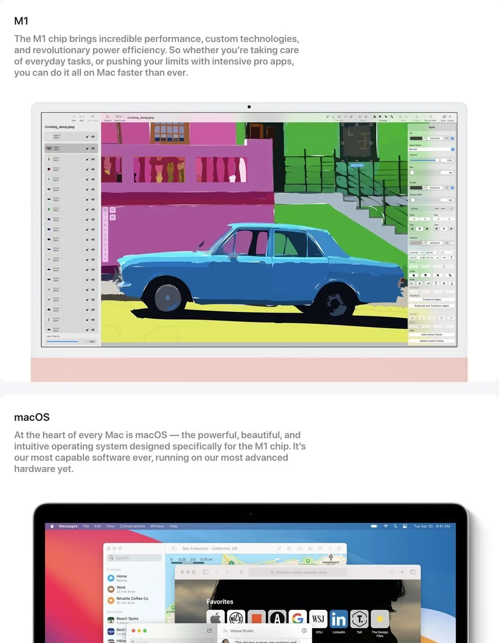
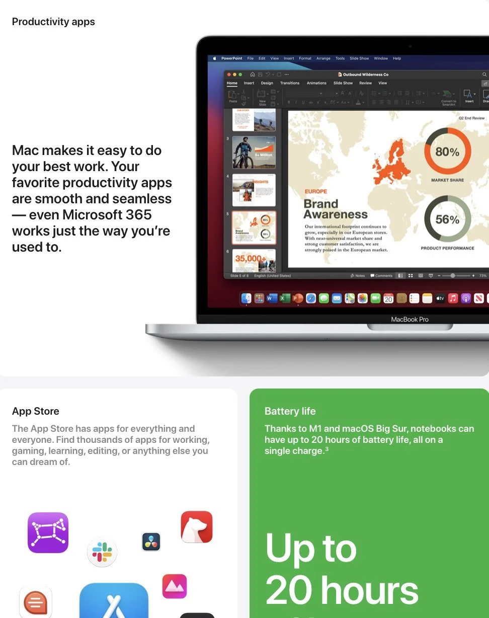
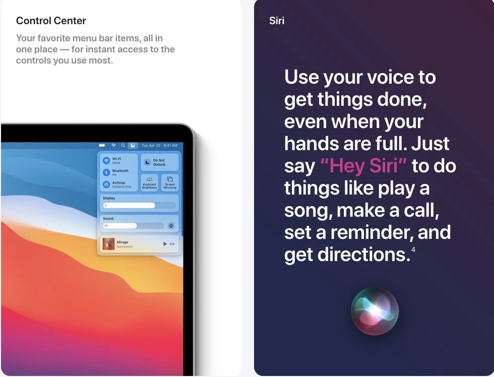
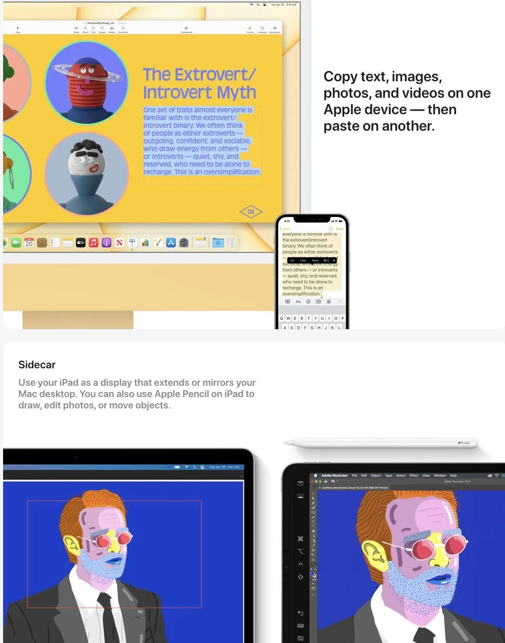
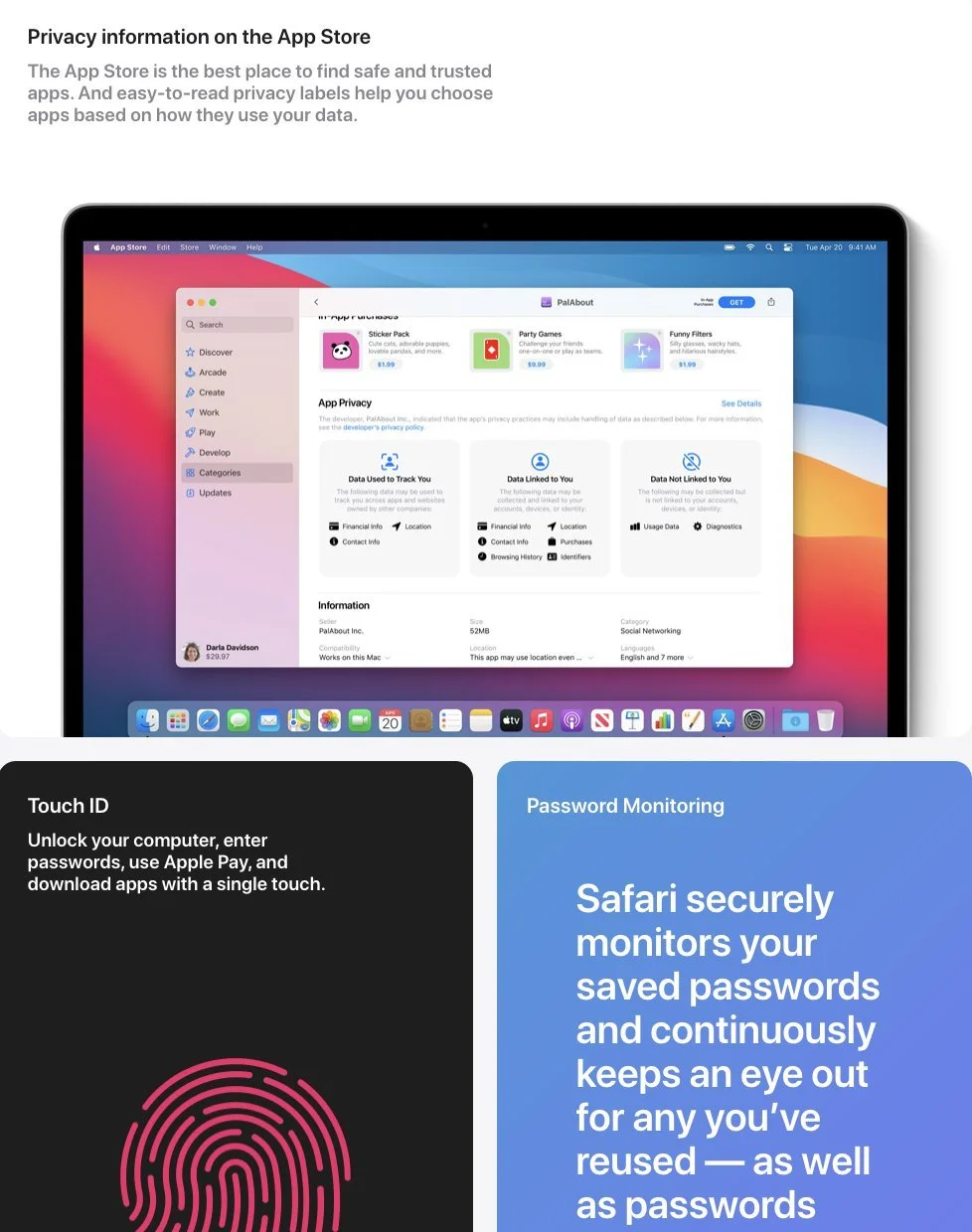
We rebuilt the page from scratch around what a PC user actually wants to know before switching. The reasons that matter most are right up top and easy to skim, and pop-up windows act as a way to house more detail for anyone who wants to dig deeper. We also built the flow so it could be reused for future "Why Apple" pages.
What I did
I worked with a team of designers and engineers to build the page's structure and flow from the ground up. On the copy side, I wrote clever headlines and kept the explanations in plain English, so the complicated stuff was easy to follow.
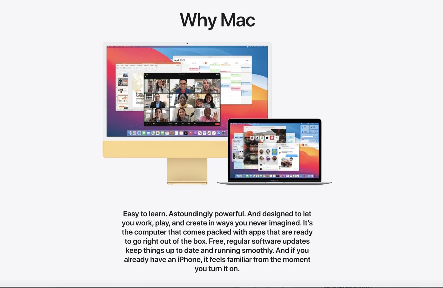
Website
Five hero panels in a sideways scroll. Swipe or scroll to see them all.
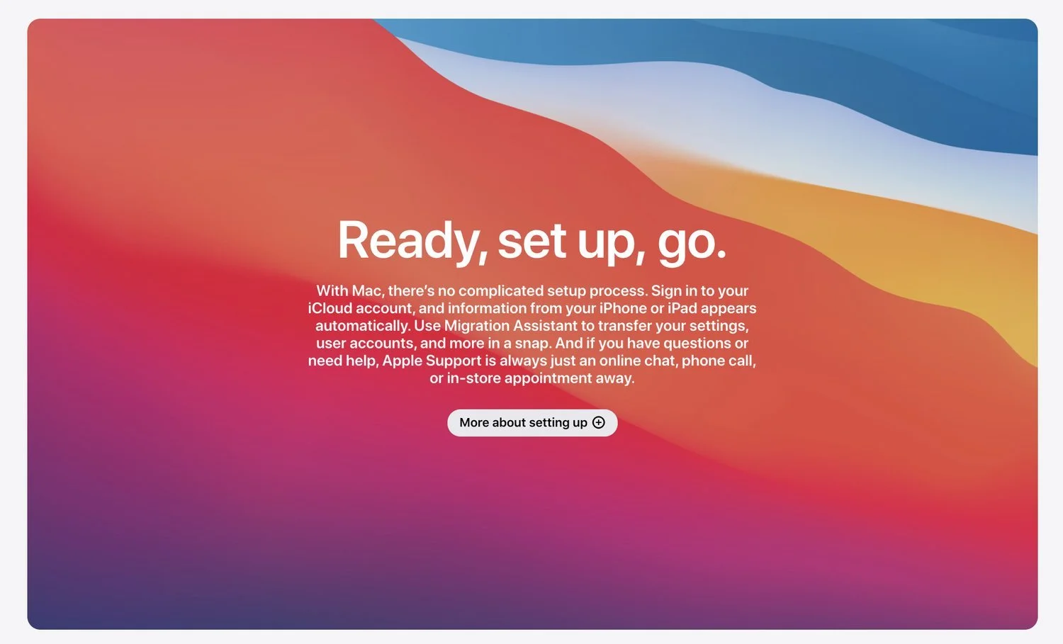
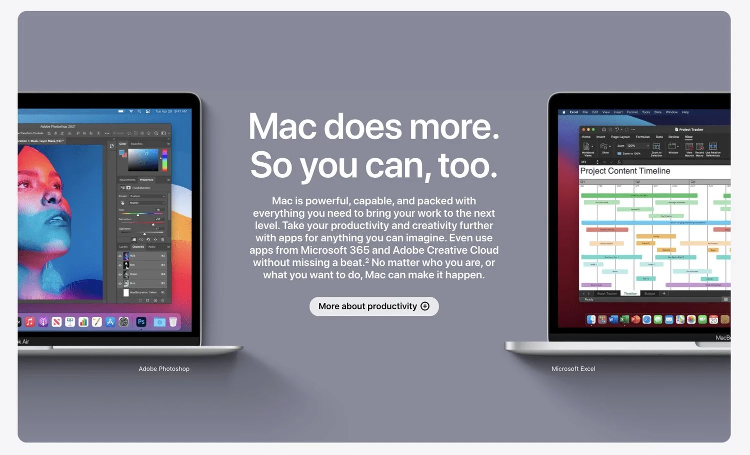
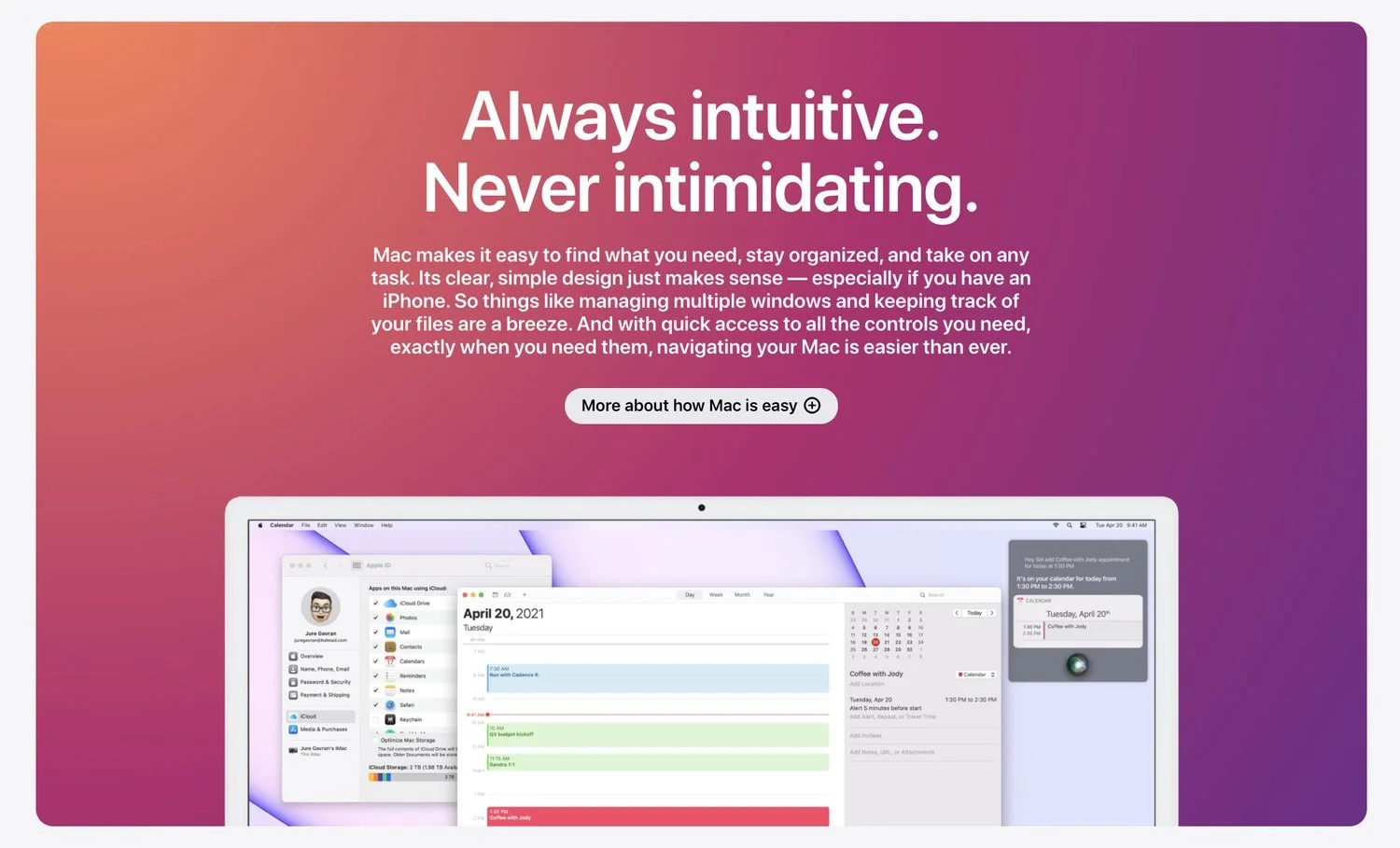
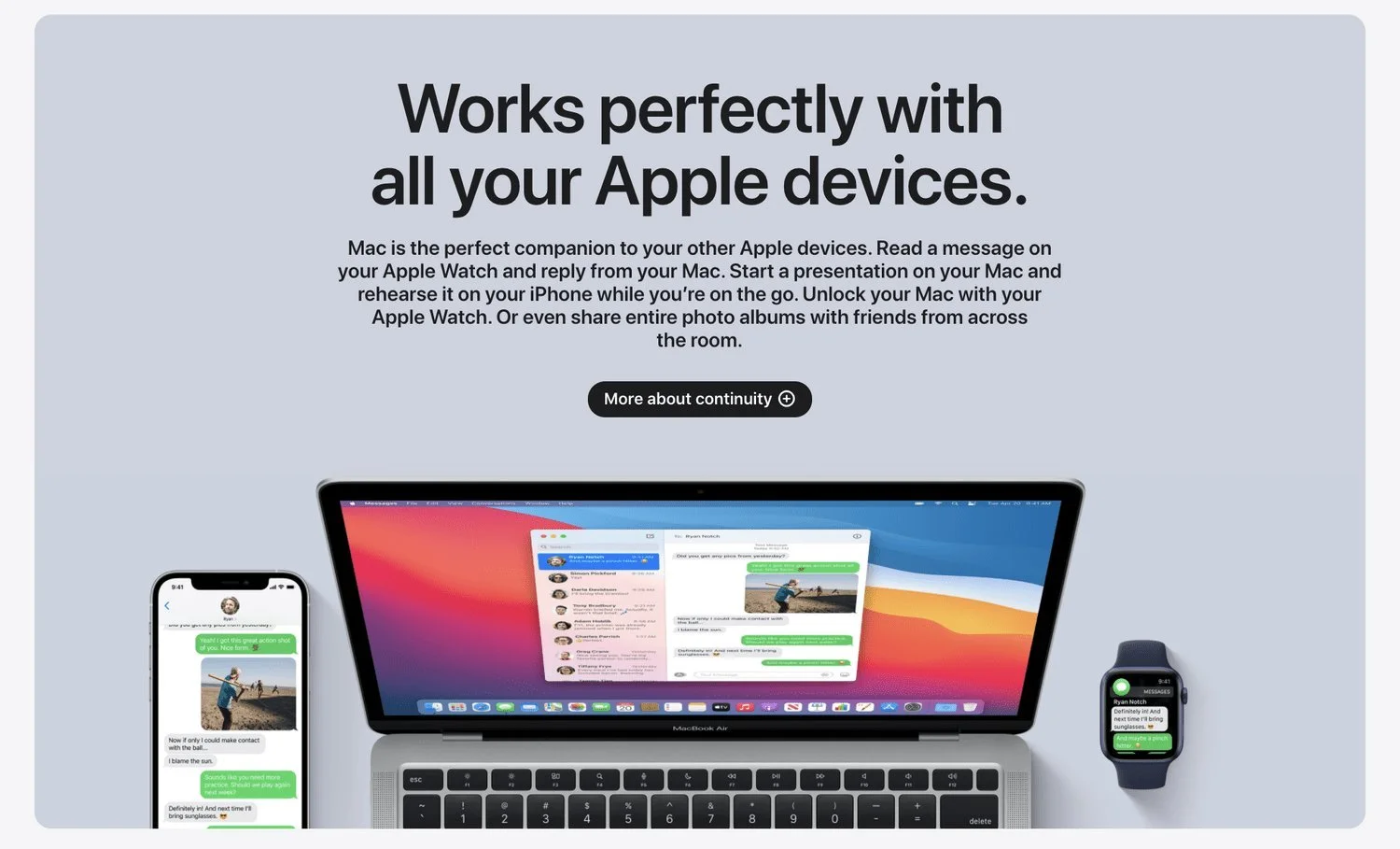
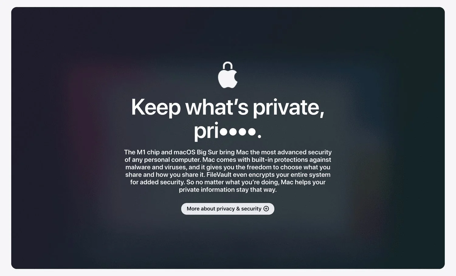
Pop-up windows
What opens when you tap “More about…” on each panel.