Homepage design system
Airbnb Homepage Redesign
A flexible design system that makes the Airbnb homepage easier to read, update and localize.
The problem
The Airbnb homepage had a problem. It was visually disjointed. It had no messaging hierarchy. It was a nightmare to localize. It was, in a word, overdue for a makeover.
The idea
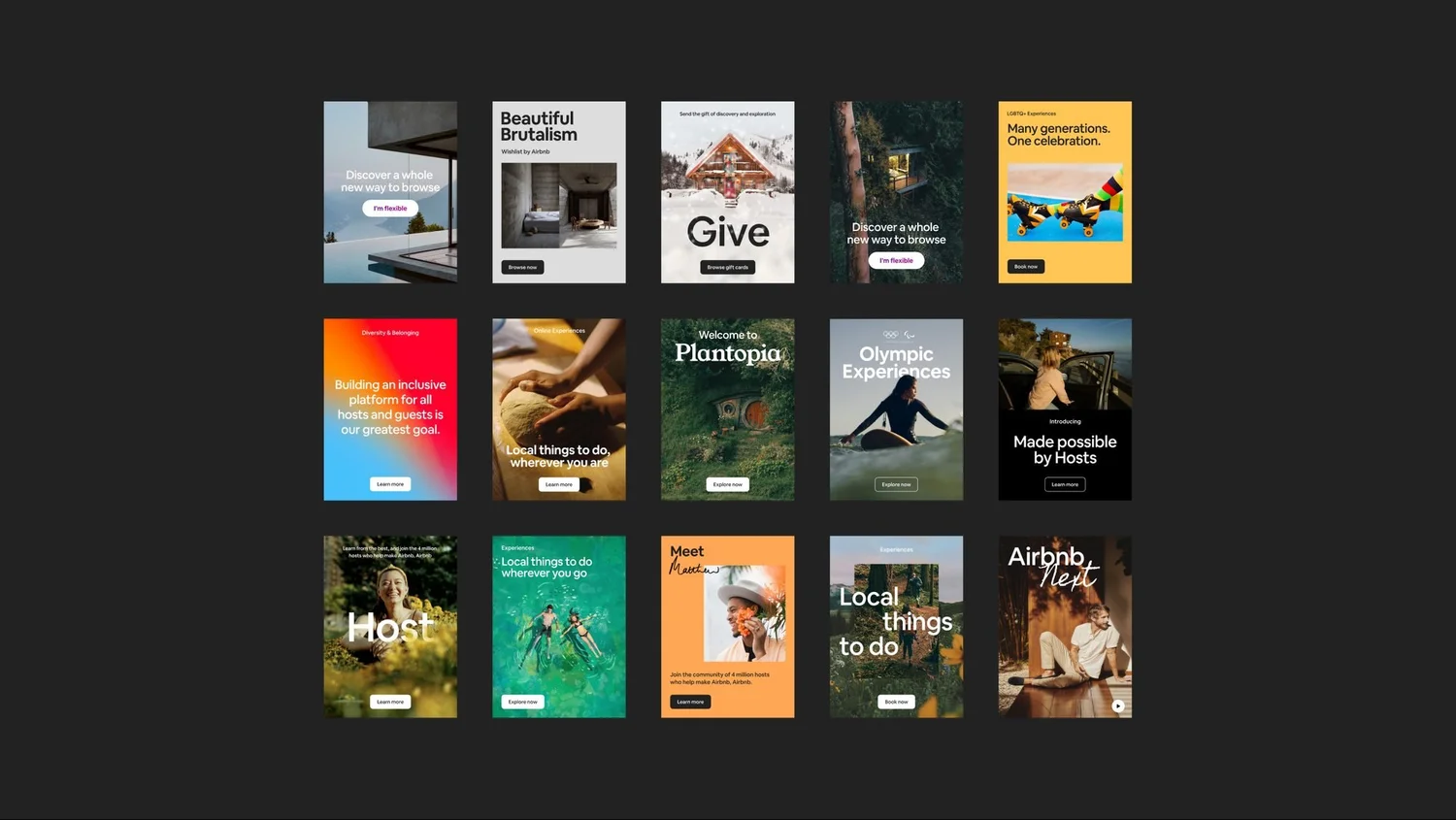
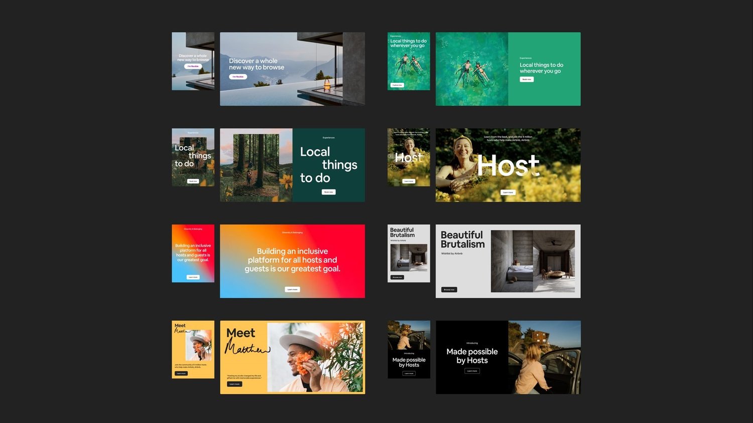
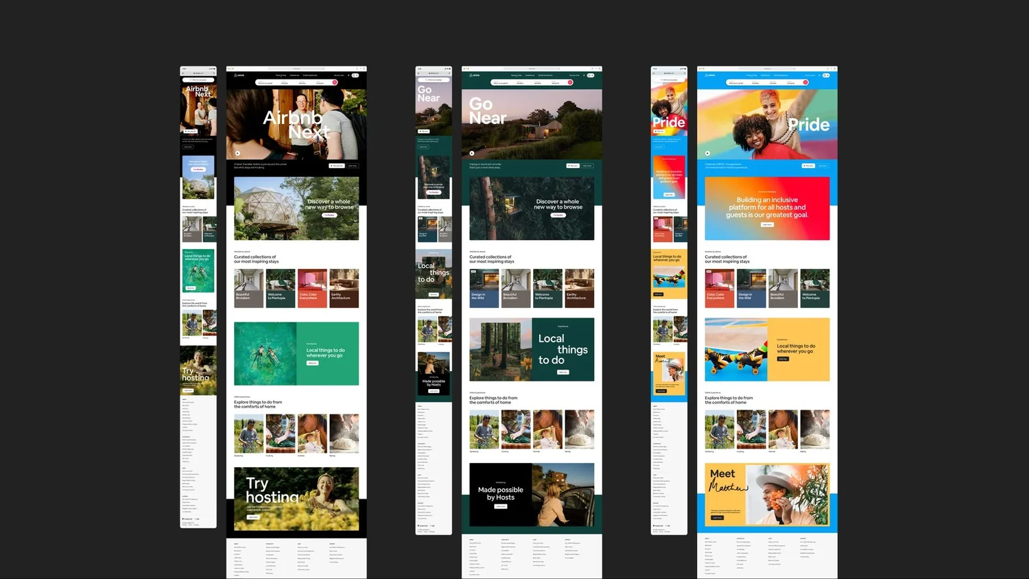
Stop designing one-off pages and build a kit of parts. Working across teams, we created a set of simple, scalable components (one type system, a few modules that mix and match, backgrounds that flex with the content) that turned the homepage into a flexible canvas the brand could actually play on.
What I did
I worked side by side with designers, prototypers, marketing and leadership to sharpen how Airbnb talks about what it offers. We figured out how the copy would sit inside the new look and feel, and how it could help people understand the product and keep scrolling down the page.
The homepage before
Where we started: new commissioned art in the header every month, plus editorial collections like The Greatest Outdoors that changed with the seasons and events.
The system
We eventually landed on one set of modules that could flex for any season, market or launch.